Monday 23 November 2009

So Maybe Theres More

Right so after some discussion in class today, I've decided that I'm going to add more to my interior view, I'm happy with my outside, however I'm going to create a bin for the outside, as I think it will add more detail. But the major works going to be completed inside.
I'm going to create some bar stalls around the bar, create something to go on the walls as they seem a bit bare, and put colour lighting over the dance floor area. I better go and get cracking.


Right I decided to create something round for the walls obviously to keep in with the space theme. I created a sphere deleted half of it's faces, so that I had half a sphere, I textured it with a blue glittery texture and positioned on the wall, I orignally decided to put 3 on each wall, but it looked too much, just in your face, so I decided to just have it on the back wall ,to make a feature of it.


I think it looks quite stylish and really compliments the other objects in the scene.


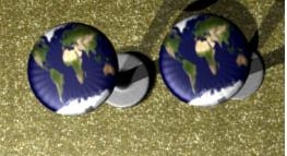
This is the seats that I completed for the bar, I created them by using a circle and exstruding upwards and scaling inwards and outwards. The main texture is metal and the seat cover is the earth texture that I used for the planet seat outside. I decided to use the earth texture for the seats because the user is sitting on earth, it may help them remember where they are in my space themed building.


This render is the finished bar with everything in position, I am very happy with it, I think it had realistic detail, and all the objects you would find in a real bar.


The last object I had to make was a bin for the external view. To do this I created a circle exstruded it upwards, then cut out the top faces so you would see inside. I then textured it with a silver glitter texture. I think it works quite well and makes it look like it was made out of concrete, even though the texture isn't that strange.


This screenshot shows the bins within the scene.


This is the final thing I had to do for my internal model, the dancefloor area. I created some spot lights, changed the colour, adjusted the settings available, and then just positioned them. I think they work really well and look really pretty, I'd happily dance in that area.

Friday 20 November 2009

Week 10: Pretty Trees

I'm currently 7 minutes into the tutorial, just got to the bit where we are left to get on with making more branches ourselves, so thought I'd add a current render, incase I have problems like last week, so I've got a bit more to show for myself.


It doesnt look like much yet.


This is the tree 11 minutes in, just used the sculpt tool for the first time ever, I've never needed to use it before, so it was good to learn it now incase I ever do. To be honest I feel like the tree is at a stage where you could make all the spheres bright colours and it would look like a tree out of willie wonkers chocolate factory or something like, I've definutely got a visual in my head.
From the last stage up until now I've had a few problems but that resulted to the fact of not knowing how to move things from one layer to the next, therfore I had to go to an earlier saved version and do a fair bit again. On my first attempt one one of my spheres went into the new shape. On the second attempt a few are missing not really sure why, but it would mean I'd have to go a lot of stages back, so I'm hoping it will look alright without it.


Just had a bit of a panic moment at around 15 minutes my branches disapeared after generating the selection. I looked at previous comments and other people had had the same problem, so I did what they said, still a problem, followed what another person said, and a problem again. It was not until I realised there was a comment in regard to this on the lecturers blog that my problem was solved, simply not pressing the 'Fill Twigs' button. It seems so silly for one little thing to make such a difference, but that what the tutorial is so far unfortunately.


Here is my most recent render after adding the 'Normal Mapped Bark Texture':
This next render is the stage after just texturing the leaves and rotating them so the top of the leaf is facing the sun, its at minute 21:

I think its starting to look good, if only all my branches had leaves on them, but atleast I get to finish the tutorial and see an end result hopefully. And to be fair leaves on trees are uneven, so I could just say that part of the tree is dead haha.


Here is my final tree, with the red colouring as used in the 'Node Editor':


The red/orange definutely makes the leaves appear more like autumn, which is pretty approriate for the time or year.
I also created a little scene for it some grass and a background, with the background one blender kept having to close as it was crashing I presume, just tried it without the background and the same problem, thats a shame as I thought the tree looked good in a scene, oh well more time wasted.
Overall the tutorial was pretty useful, and the effect was nice, just some things seemed more complicated than they needed to be, like for example why couldnt the bark texture just be put on as a regualar texture it didnt make any difference to me but hey, nice result in the end.

Tuesday 17 November 2009

Sketches/ Ideas

From my research it was clear to me that I wanted a single storey building. I wanted it to be single storey as most bars/ clubs that I go to are that way, and I wanted it to be as realistic as possible. I then decided that I wanted both aspects to be seperated so that it didn't comfuse the user, therefore I have half bar and half club. The shape of my building is did change from square to sphere, this was also to do with realism, most buildings I've seen are square/ rectangled so I thought it would be best to make it look realistic. It wasn't until I'd done more research and stepped further into my theme that I decided that I coud make it a bit different, yet look realistic, I'm really happy with the end result.


When I started to make my models I found it hard to work out where I wanted what etc. So I decided to draw them to make it easier to work with and visualise.


This was my external view, before I decided to change it.


This is a drawing of the external view that I decided to create.


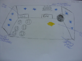
This is the internal view before I changed it. I needed to change it as the shape was square, and my new external view was a sphere.

This is the internal view that I am currently creating, hopefully it will continue to look like this. The strong colour themes are gold, blue glass and a moon texture. I wasn't originally going to stick to a colour theme, but as I was working along I found that it looked more attractive.

Saturday 14 November 2009

Would You Like To Come Inside?

eeeee so I started my inside properly just now, and I'm in a good mood because I've been worried about it like I wasnt sure how things were going to go together, like for example I wanted to make a DJ stand but I wasn't sure what to put on it. I made it in a different file so that I have more room, I'll merge it later. The thing is once I started I couldn't seem to stop the ideas just kept merging, I just hope that the rest of the internal view goes like this. All I know is that it's going to be really interesting putting it all together as the shape is now a bit awkward but we will see.
This is the till that I modelled for the internal view, it will go in the 'shop' area of the building. I creeated it using a plane with various exstruding and deleting of faced. I used a gold glitter texture for the overal object, with plain black keys. The screen is a seperate plain, that I textured white.

Heres the DJ deck bit, I'm pretty happy with it, had a few decisions to make in regard to the deck slider/ button thing, but thats explained in my report. I'm in a good mood, feeling much better more productive after tomorrow. I'm spending way to much of my time on the module, better get on and do some of another one soon.


Haha well I've just started my internal view again, 3rd time lucky aye? Because it was so awkward in shape I was unable to actually put anything in it, as the back wasn't further enough, I initially exstuded the back further back and exstruded the front line forward so it looked even on the sides, but it just ended up looking messy and horrible, and still didn't really work. Also the floor was uneven at the bottom so not really realistic anyway. I probily could have completed the project with it, but it just didnt look good enough, and would have made it much harder to complete. So I was thinking of an easier way, hmmm if only I could use a cube, its so flat I thought to myself. Thats when It hit me, what if I could use a cube but round the walls so that it gave the effect that it was the inside of the Sphere used for the outside. I looked online for tips, and it was so straight forward that I dont know why I didnt think of it before, simply put a subsurf on it. So now I have a cube with rounded edges, which gives the effect that its the inside of the sphere AND has a straight floor and depth, so much better. Although to be honest I could have used a cube shape and just said that the inside had the walls bored up or something, but atleast this way it fits the part.
You could say that it looks just like my previous one, but trust me it's so much easier to work with, you just cant really see the depth until theres objects in it.

Well as I was working out what I've still got to do today and realised there wasn't a lot of this model left to complete, so thought i'd better post some recent renders, so you can see my train of thought.


Here are two views across the inside of the building. All I've got left to do is create and add some bottles to go on the shelves then sort out some suitable lighting, not really sure what I'm going to do for it yet hmmm.


I'm much prouder of the internal view, I think it may well have taken me less time, but thats because I've become more confident with 'Blender' as a software as the shapes I've created in here are much more complex than those of the external view. Then again it could all faze down to the gold colouring it is rather attractive.


I thought I'd add a render of the beer pumps also as there is a fair but of detail on them, including the difference of logo at the top that you can't really see far away. I created them from a space and exstruding, followed by the use of a lattice to get some more shape into them.


Well I've just created the bottles, textured them and positioned them in place. I used the same blue glass texture as I used for the outside building, and a cork texture for the top of the bottle. I created sphere bottles to continue with the space theme. Here they are in position, I think the contrast of the blue against the gold and moon texture looks beautiful. I'm really happy with it, all thats left to do now is sort out the lighting, I think I might see what the bottles would look light lit up, like that tutorial I tried last week, have to have a good think.


Now I have finally finished the internal view I thought that I would post a few renders of the finished results.



Friday 13 November 2009

Week 9: This Barrel Is Going To Kill Me

Normlly I complete a task then write about it, but because this is going to terribley and I know that my final result isn't going to look like the one displayed I thought it was better to write about my progress and how its all going wrong, because I am at the stage now where I am screaming at my computer and trying not to swear as I write this.


It seemed to be going to well, I made the barrel and outside rings just fine, it wasnt until I needed to scale it down and did exactly what was said that it began to go wrong, and this was only 10 minutes in only 25 more to go. When I scaled it it still messed up and was uneven but I decided to carry on anyway, the main problem and where I am now is when I need to make seam the top bit that I've just made it just wont let me select more than one strip of the barrel at once and I cant even describe in words the frustration that I'm at, I thought I was making progress this really was begining to clip into place, but now I cant do it, I really cant. My only plan of attack is that I just texture the top normally and more past this I think that is all I can do if I'm ever going to finish this, its taken me about an hour and a half for 13minutes of this, here is my render so far as you can see its not great, but I can only hope to get a finished version now rather than an amazing one.


I called the image awful and that is because it simply is.


This is it with textures, I briefly used the style of image mapping suggested, however after a while I had to use my own experience as my model on 'Blender' kept flashing black making it unbearable to work in. I'm not sure if this is because it's friday 13th but this has been the worst I've ever felt doing work in a long time, I'm just glad it's over, its really knocked my confidence, but hopefully when I come back to my 'Blender' work tomorrow I'll feel better.


I apologise for the view of the render, as my barrel was too big for the camera view I had some problems getting a good view of the final barrel, this was the best I could get that showed different aspects of the model.


This week someone in class showed me an interesting tutorial, which I decided to check out. The aim was to make an object glow. I thought it could be quite useful to use for my external view for the building itself. But even if I dont use it, it was interesting to learn. Heres my render:


I'd been meaning to look at how to do text for a while, as I obviously need to be able to write a sign for the front of the building. I had thought that I could just make a texture with text on worst case scenario. Anyway I set off to find a tutorial as to how to do it, I couldnt believe my luck when I started a tutorial I'd found on 'You Tube' and it was simply an option when you add an object shape like cube etc. I don't know why I didn't think to look there before. The tutorial was very straight forward, so now I'll be able to create text with the lettering of my sign then possition it infront of the gold texture on the front of the exterior. It will look really nice as it will stand out due to depth of the text, which in theory you would expect to attract for customers that way.

Tuesday 10 November 2009

Come On Outside

All of my modules this year demand a lot of work, constist work is being done on my part. Because of this I want to try and get my modules done as soon as I can as they can be done now, whereas other things I need to do, even the tutorials for one cant be done, they can only be done as the appear, and I have no module especially that cant be done yet. I'm pretty happy with the progress of my external view. I've done a little bit of the inside, but because my internal view requires a lot more detail and things that I'm not as familiar at doing to complete it,I've decided to focus on the external view for now and try and get it finished.

The major lifting has been done. I need to position the planet seats, make some lamposts for the edge of the scene, work out how to texture and create the sign that goes on the front of the building, and obviously decide on a background. Then it'll be done and I recon that can be achieved in the next few days. Its the internal view that's going to take a long long time.

I've been playing around with the main building and what a difference one button can make or even a colour, I cant decide on what colour to have the building as, I know I want it as blue glass

This is with light blue glass, but I think because I have concrete ground and concrete lamposts it makes the blue look more grey.


This is with the dark blue which does look rather nice but I think it seems a bit too much in your face hmmm I'm not sure.

Also both of these images show the main building without a 'Subsurf' or 'Smooth' on them, so I thought id try a view with them both on and yuck!
It just doesn't look right for the building, especially as it helped the glass texture before, so I am going to have my building some what naked as it really brings out the glass, whereas this looks like a gum ball or something, which is fine for the seats because if it was real they would be paint. So do no think that I have forgotten too smooth anything, it is just the effect that I'm going for.

I have almost finished the external view, just got to position to lamp posts correctly, do some mood lighting and sort out the sign for the front, which will be done at a later date. I'm really happy with it, I know I've used a lot of skills that I've learnt throughout the module, and after that first lesson of creating a little box house, gosh I got in such a state over it. In my wildest dreams I didn't think I'd be able to create anything of this level


eee finally finished the outside, just got to do a lot of work for the inside now, very happy. Below are two views of the external view. I did try various things but they didnt work which was rather anoying, I did try adding mist, but it just made the model blurry, and you could see the background image through the models, so it just didnt work. I also wanted the lighting to be from the street lamps so it looked like it was evening time, but whenever I went to do it it just didnt have light coming from anywhere which I found strange considering I positioned the lights from the lampposts. I even tried different ligting such as 'Lamp' and 'Area'. So I just ended up positioning lamps there but other places aswell.


Since doing this I have gone back and added bins to the external view, so below are a few renders of the FINAL finished model.


Monday 9 November 2009

Research/ Progress


As time goes by the deadline approaches and these tutorials are only worth 20% of this module, but it seems to take me so long to complete them. I've never been very good at anything to be honest, I've only ever been 'ok', because of this I'm very happy with my performance, as I'm getting there even though its taking me longer to pick these things up. Dont get me wrong I'm not what you call 'slow' or 'thick' I'm inteligent, yes I have my 'blonde' moments, but I'm just some what programmed to not be amazing at anything unfortunately. But I'm trying my best and my project will be completed, because something I am good at is putting in effort and trying my best.


When first looking at the brief I had a strong idea of what path I want my project to take, it is going to consist of a strong theme of 'Space' planets, stars whatever fits really, which takes the sci-fi that the client is interested in, therefore he should like it. To help me get a good idea of what I wanted and to give me some inspiration really I did a bit of research, looked for images on google to see what was already out there.


The first image I came acroos was that of planet hollywood, which I have been to, don't think I have a picture of it though. From this it made me realise how popular sci-fi is within the world, I dont like things like star trek but I would be attracted to go to a building that looked like that. It is however quite in your face not sure if thats what I want, but its a beautiful building none the less.


This is another exterior view of a building with a space theme, I think the architecture for this is amazing, its eligant and slender. The chosen lighting also shows of the curves.


This building is quite the opposite of the above building, it is bulky and reminds me of the space centre in florida that I went to on holiday a few years ago, if only i'd known about this project then, I would have payed more attention and taken lots of photographs.


Yes this isn't a real building it's lego. But it just shows that a simple building accessorized with space objects in the surroundings can make a normal building look space themed, which may well be the effect I go for. It also shows sci-fi as an interest in a different age group.


It doesn't say but this could well be the interior for the slender/curvey looking building. There isn't any obvious space themed objects, but for me it seems like the lighting and the glass wall ( which means you can see the sky/ moon/ stars ) give off the effect, so it has looks of a strong theme but with less effort. It also appears quite classy.


Now for me this is the most space/ futuristic themed image I've found so far, it just looks amazing. The complete opposite to the above image, even the lights look like they represent planets, its much more what I'm going for ( I think:S )


The one thing I have noticed is that there seems to be a lot of sphere shaped objects used, that is something that I will definutely take away with me and incorporate into my designs/ models as much as possible. I'm guessing that is because it is the shape of planets, and making a star shape would be a bit awkward to create into something useable.


To be honest with you I had started my projects previously and after researching I thought they looked pretty awful, to basic, for instance my external view looked like a normal view, and what I have of the inside is obviously the same shape, unfortunately I didnt think to show my external view before I started modifying it, I do have my internal though, which I will change to fit in with the shape of my external view in a second. I will however keep similar aspects, it will only be the actual shape that will be changed, as I thought it was pretty boring before and I want my building to stand out. I have drawn sketch's of my old views, so I will put them on here, along with the new sketches which I will need to do later, so you can see the difference.


This is the start of my original internal view didnt get very far but still, this will be changed in a bit.


This is my external view so far which I just created as there isn't that much detail yet, I have however decided to make the building glass, not sure how well you can see that in this render though.


This is the internal view at its current stage, as you can tell i've focused on the outside view for now, yes it does look a bit like a big banana with just a yellow texture, but as I think I want it to have a gold glittery texture this was the closest thing as I haven't been able to find a good one yet.

Because there is no detail inside yet, you can't really tell the dimensions but I asure you it is 3D.


I'm a bit comfused as to how to add more than one texture to an object, so I asked my lecturer for advice, she said there's some tutorials by 'Neil Hirsig' on it, which brought me back to that tutorial we'd done using more than one colour, i wondered if that would work the same way. Anyway I looked through his tutorials and found one called' Multiple Textures' that I will work through in a second, but firstly I found one about adding mist, I thought that sounded interesting so I decided to give it a go.


I found it really ineresting to learn that by doing the slighest changest such as different in 'Height' or 'Misi' the effect can be completetly different. I originally thought i'd try the tutorial as if could be something I could use in my external view, but after trying it out I'm not so sure as I'm worried that it could cover up most of the detail, but it would help give a mysterious/ spacey effect, so I may add the effect but use a low height so that it is only around the floor. I hope by doing this however that you can still see the texture detail in the concrete etc.


Next onto what I've been waiting for, I really hope it helps me with my problems, such as how to add the sign. And I'm going to need to use it alot when doing the internal view I'm sure.


I used the planet earth as my first texturre, then put the foil suggested as the second texture, to be honest I dont think that they appear very clearly due to the light blue background colour behind them, but if we change the background colour to yellow like suggested it gives a completely different effect, you can see the dimesions much clearer as the background colour is more obvious. My only worry at this stage is this isn't what I need I dont want to add two colours over each other, it may come in handy in future, maybe I will need to do this for my Internal view I dont know yet, there is still 10 minutes left so hopefully what I need will come up.


The third example which has all been done on a colour map, with marble's orange colour background and black wax paper, I think the effect is actually quite pretty.
At the end of the tutorial we played around with different settings my favourite was when it was set to 'Hue' I think the effect is interesting to know, and it looked the nicest. Unfortunately that was the end of the tutorial and it didnt have what I wanted to know, So I've just wasted a bit of time on something useless, but I guess I learnt a new skill that might come in handy one day. My next plan of attack is to go back to the tutorial with two different coulours there was a ball and a cross and I'm going to see if that works with textures, it's been a fair few weeks since that tutorial was used so I'm a bit hazy on the details, wish me luck!
Well that didn't work either it only let me do it for colours, this is driving me crazy, roll on monday when I can ask for some more help on this and hopefully get it working arghhh.