From my research it was clear to me that I wanted a single storey building. I wanted it to be single storey as most bars/ clubs that I go to are that way, and I wanted it to be as realistic as possible. I then decided that I wanted both aspects to be seperated so that it didn't comfuse the user, therefore I have half bar and half club. The shape of my building is did change from square to sphere, this was also to do with realism, most buildings I've seen are square/ rectangled so I thought it would be best to make it look realistic. It wasn't until I'd done more research and stepped further into my theme that I decided that I coud make it a bit different, yet look realistic, I'm really happy with the end result.
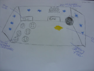
When I started to make my models I found it hard to work out where I wanted what etc. So I decided to draw them to make it easier to work with and visualise.

This was my external view, before I decided to change it.

This is a drawing of the external view that I decided to create.

This is the internal view before I changed it. I needed to change it as the shape was square, and my new external view was a sphere.

This is the internal view that I am currently creating, hopefully it will continue to look like this. The strong colour themes are gold, blue glass and a moon texture. I wasn't originally going to stick to a colour theme, but as I was working along I found that it looked more attractive.
 This was my external view, before I decided to change it.
 This is a drawing of the external view that I decided to create.
 This is the internal view before I changed it. I needed to change it as the shape was square, and my new external view was a sphere.
 This is the internal view that I am currently creating, hopefully it will continue to look like this. The strong colour themes are gold, blue glass and a moon texture. I wasn't originally going to stick to a colour theme, but as I was working along I found that it looked more attractive.

No comments:
Post a Comment